Mileage Labels Confusing, Survey Says


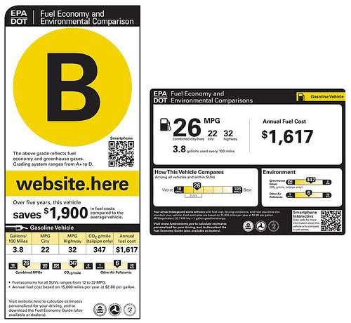
The recently proposed new car stickers from the EPA are confusing to most potential car shoppers, according to a survey. The vertical sticker with the letter grade was found more confusing than the horizontal one.
According to the survey conducted by global branding firm Siegel and Gale, 46.8% found the vertical label confusing while 37.7% found the new horizontal label confusing. Sixty-six percent of respondents preferred the horizontal label to the vertical, coming in at 34%. (Schoolteachers might make up a large chunk of that 34%.) The survey involved 456 people who are older than 18 and who intend to buy a car in the next three years.
The study found multiple times that the most important figure to buyers was the overall mileage and the cost per year. Respondents were generally clear on these figures.
Much of the confusion centered around how new types of hybrid and electric vehicles were represented.
But a surprising 74% knew why a gas-electric hybrid like the Chevy Volt had two different gas mileage ratings on the horizontal label. That compares with only 54% who understood the giant letter grade on the vertical sticker — meaning an A rating indicated better-than-average fuel economy.
In fact, when looking at the vertical sticker with the letter grade, 62% of respondents believed any type of vehicle could get an A grade, when actually only electric, gas-electric and other alternative-fuel types can secure an A-plus, A or A-minus. The highest a gasoline car can get is a B-plus.
The letter grades would make an impact on a shopping decision if it were a B-minus or lower, the study found. This equaled 91% of potential shoppers and would make anyone in the car-selling business blanch.
The study even broke down political affiliations. Republicans favored the horizontal label more than Democrats, 71% versus 63%.
A few quotes from respondents are below. Let us know what you think in the comments as always.
- “I think everything necessary was on the label.”
- “I can’t think of anything being left out.”
- “The level of pollutants is confusing when comparing that with the rank among all other vehicles in the category…it is not clearly defined in the text below.”
- “I would want to know how the testing is conducted. Was the vehicle full of people and luggage, empty, full of fuel? What are the testing parameters?”
- “Just give the MPG and leave out the P.C. non-important information.”
- “The simpler, the better for me. I don’t want to be overwhelmed with numbers.”
- “I also like the letter grade system and I think that could be put on the label along with the MPG ratings. Then you could have a little chart saying how you arrive at the letter grade. That explanation would help a lot.”
- “I still need to view estimated total annual operating costs; not focus on fuel exclusively.”
- “Not all people are going to be able to understand the information on these labels.
- They need to be in more layman’s terms. Although this is important information, I still feel safety is the number one concern.”
- “ A key should be included at the bottom that explains the abbreviations.”
- “I think the ultimate label should have both the MPG combined scale and the grading scale of A+ through D. I found both very useful and am disappointed that both features are not on both label options.”

Former managing editor David Thomas has a thing for wagons and owns a 2010 Subaru Outback and a 2005 Volkswagen Passat wagon.
Featured stories


