New Year, New Me: These Manufacturers Have New Logos for 2021

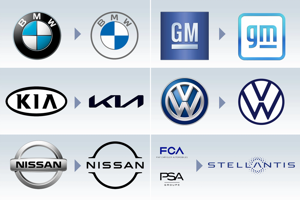
According to a lot of the sponsored content popping up on my social media lately, a new year is a time for renewal and a commitment to change or new things. I’ve never loved those sorts of resolutions, but several automakers are taking the theme of “new year, new me” literally, unveiling new logos meant to signify, well, something. A few even got started early, revealing their new branding before 2020 turned into 2021.
Related: The 2021 Outlook for Car Shoppers
- ${price_badge()}
- ${ami_badge()}
- ${battery_badge()}${ev_report_link()}
- ${hot_car_badge()}
- ${award_badge()}
- ${cpo_badge()}
${price_badge_description}
${ami_badge_description}
The EV Battery Rating is based on this vehicle's current expected range relative to the vehicles expected range when new. ${battery_badge_text}
Certified cars are manufacturer warrantied and typically go through a rigorous multi-point inspection.
This car is likely to sell soon based on the price, features, and condition.
${award_blurb}
${award_two_blurb}
Shop the 2021 Volkswagen Atlas near you
Not only do I dislike resolutions, I also know very little about graphic design. So to help analyze these new logos — which may or may not appear on vehicle badging — I enlisted the help of Cars.com’s Lead Designer Paul Dolan and Senior Designer Ken Nesbit.
Let’s check out some logos.
Corporate Logos
The first two designs — one redone, the other all-new — are for larger corporations made up of many individual automakers, so they’re less likely to ever appear on vehicles.
General Motors
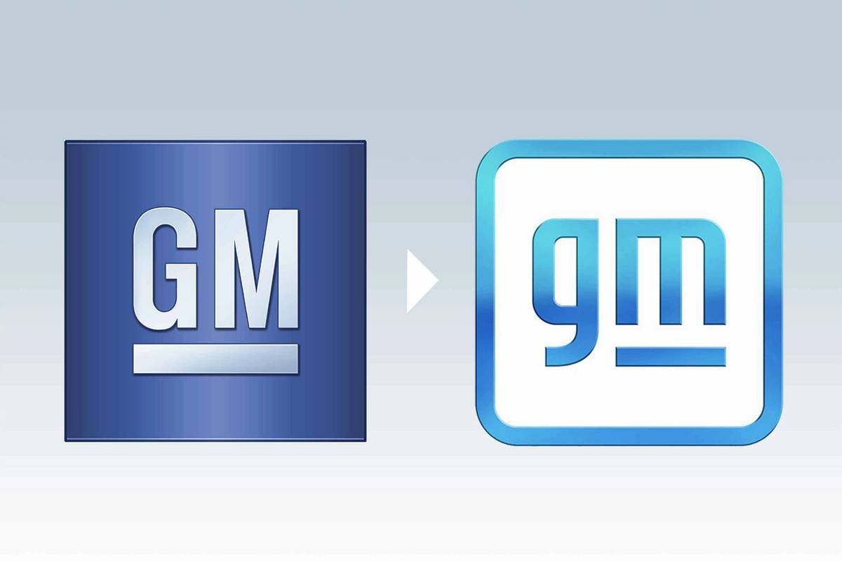
What GM says: Deborah Wahl, GM’s chief marketing officer, was quoted by Adweek as saying that the color choice hints at “the clear blue skies of an all-electric future” and the switch to lowercase lettering “signals immediately more inclusivity, more approachability, a more human aspect.”
What Paul says: “GM is all in on the EV theme with this redesign. The negative space of the lowercase ‘M’ suggests the lines of a power cord. Combined with the underscore around it, I’m seeing a row of battery packs, as well, and the lowercase ‘G’ looks like an upside-down electric plug. They both get away from a traditional font, looking for something more hand-crafted with sharp corners. It’s surprising that GM chose a lowercase font, but once EV cars aren’t seen as trendy, the mark could revert to a more traditional font. For now, it has a friendly, more personal touch.”
What Ken says: “The new logo retains, for the most part, the same elements: the letters GM and an underline to square up the space around the descending portion of the lowercase ‘G.’ The original square is now a line around a line. On the gradient version of the logo, there is a little bit more of a bevel on the entire logo, which might have been added to help with readability of a much lighter blue. As mentioned, the logo references an electric plug. The blue looks like the blue LED that’s in all kinds of electronics these days.”
What I say: It looks like an icon for a smartphone app, which makes sense, since it likely won’t appear on cars but might be used for smartphone apps around connected-car services. That said, I don’t much care for it — but I didn’t think the old logo was all that great, either.
Stellantis
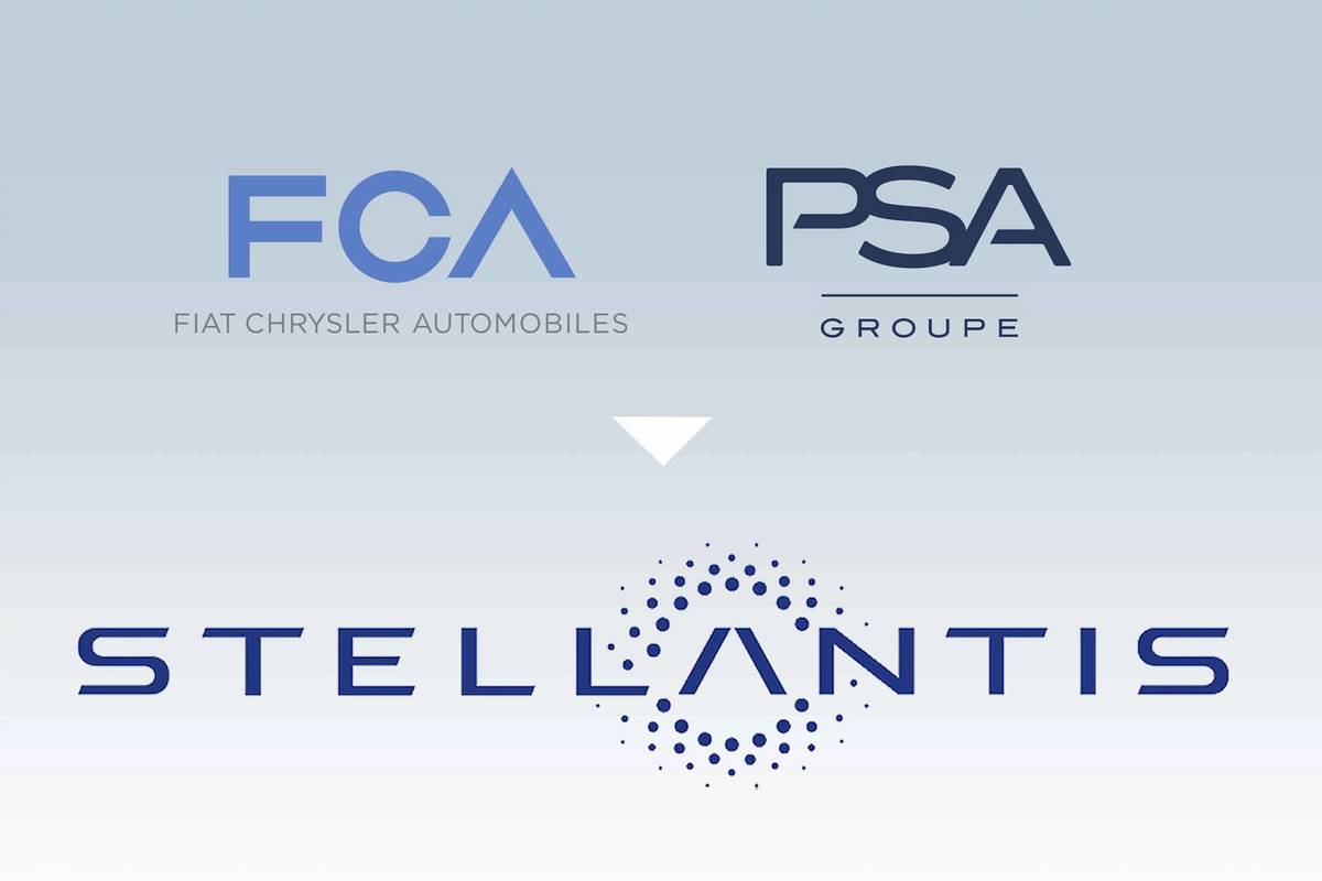
What they say: Stellantis, an automaker newly formed by merger between Fiat Chrysler Automobiles and PSA Group, said in November 2020 that its new logo “symbolizes the rich heritage of Stellantis’ founding companies and the unique combined strengths of the new group’s portfolio of 14 storied automotive brands, as well as the diverse professional backgrounds of its employees working in all of the regions. Along with the Stellantis name — whose Latin root ‘stello’ means ‘to brighten with stars’ — it is the visual representation of the spirit of optimism, energy and renewal of a diverse and innovative company determined to be one of the new leaders in the next era of sustainable mobility.”
What Paul says: “I keep hearing the word ‘Atlantis,’ so I’m not seeing stars and light but rather submerged and dissolving; if Stellantis were an antacid, the company would note the logo’s effervescence. Everything is happening around the broken ‘A’ for reasons unknown, and the name is too long, exacerbated by an extended font and spaced letters to make it longer. Thankfully, we won’t see this on any of the cars under the new company umbrella.”
What Ken says: “I think the number of stars not matching the number of brands is a missed opportunity, but Subaru already did that with its logo — using the Pleiades star cluster to represent the merging of Fuji Heavy Industries, with each star representing a company in the merger.”
What I say: It looks and sounds like a generic megacorporation.
Individual Brands
BMW
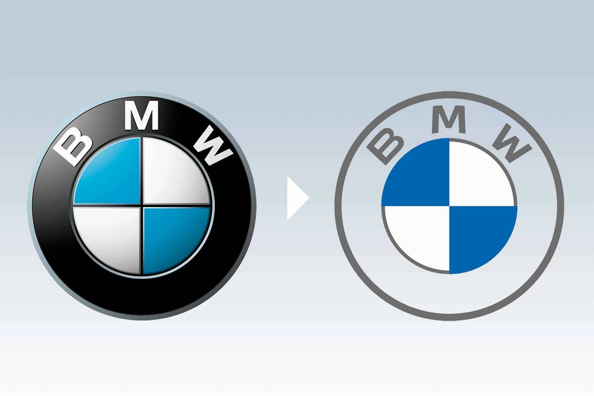
What BMW says: Upon unveiling the update in March 2020, BMW said its “new design is an expression of the revised brand identity, which places the customer at the center of all activities. Pared down and two-dimensional, it conveys openness and clarity. The additional transparent version of the logo is a more open invitation than ever for customers to join the world of BMW. The change reflects BMW’s transition from centering purely on the automotive world to being about technology and connections.”
What Paul says: “I like it. The two-dimensional look on the flatter inner circle is a nice contrast to the three-dimensional look on the letterforms and outer circle. I like the treatment of the transparent badge as a clever take on transparent file formats for the web and digital platforms.”
What Ken says: “Like the GM logo, it’s a move from something that looks like a physical badge to something flatter, which should give BMW more options for how it’s used.”
What I say: Anything that shows off some more of the excellent paint options available on various BMWs — like the green and yellow that shows off the new M3 and M4 — is good in my book. It’s a shame that most of these badges will appear on white, black or silver cars.
Kia
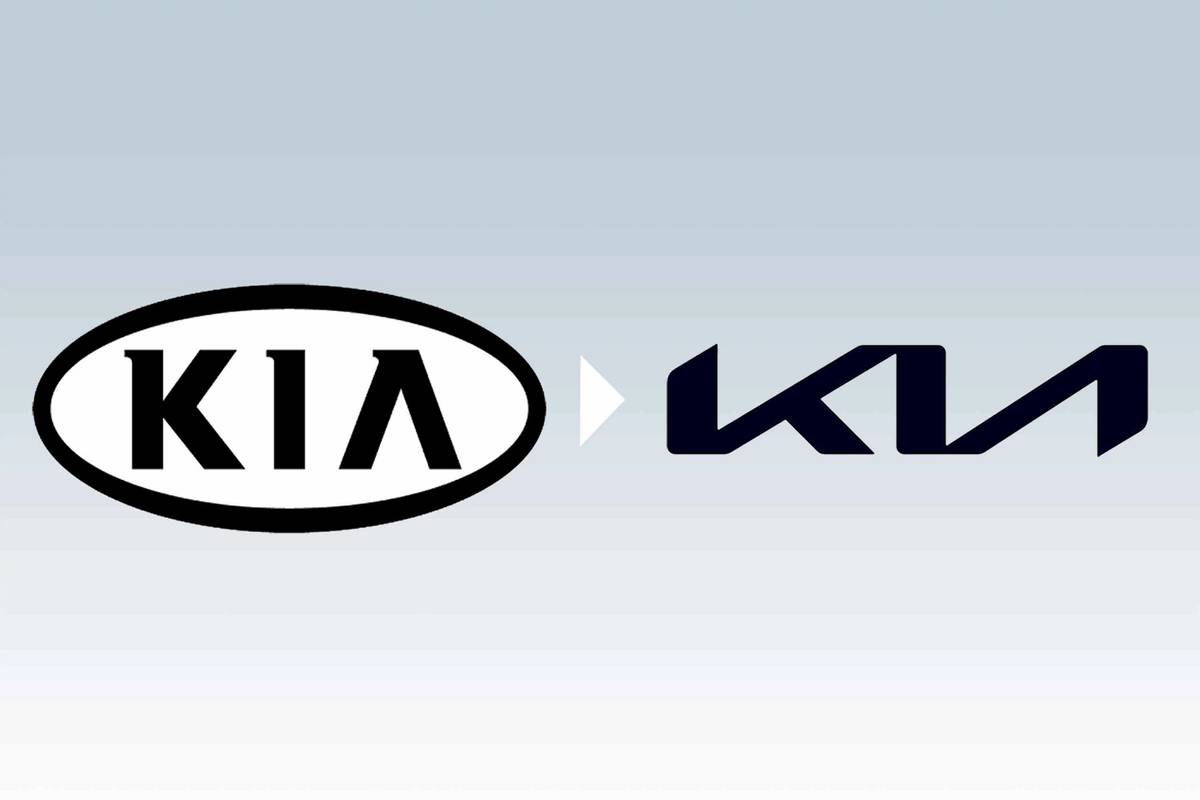
What Kia says: On Jan. 6, Kia called its new logo “a symbol of Kia’s new brand purpose and the values it promises to offer customers through future products and services, and the experiences these enable. Kia seals its brand promise by developing the new logo to resemble a handwritten signature. The rhythmical, unbroken line of the logo conveys Kia’s commitment to bringing moments of inspiration, while its symmetry demonstrates confidence. The rising gestures of the logo embody Kia’s rising ambitions for the brand, and, more importantly, what it offers customers.”
What Paul says: “Big improvement, but it’s really just a redo. It has all the motion it’s looking for, and it’s minimalistic and memorable in a tasteful way. One thing bugging me a bit is that it’s more extended than it needs to be, like Kia was trying to match the footprint of its old oval — or that it felt like drawing out the redesign a little wider would add motion. The lower leg of the ‘K’ introduces a third line weight, in between the thickness of the three pillars and the thinness of the diagonals. I would have adjusted the three widths to just two, balancing in the same way.”
What Ken says: “The new Kia logo is more distinctive, although it might be a bit harder to read. The connected letterforms are geometric but reference handwriting or brush writing. There’s contrast in the weight of the lines and a visual rhythm. Usually when we see handwriting used in a logo, it’s a reference to a written signature — a sign-off on product quality.’”
What I say: I’m surprised I haven’t heard about a lawsuit from whichever entity controls the rights to the Nine Inch Nails logo. Kia should’ve committed to the bit and changed its slogan to what Senior Copy Editor Patrick Masterson suggested: “pretty great machine.” The Korean brand didn’t have a memorable logo before and this may improve on that, but not by much.
Nissan
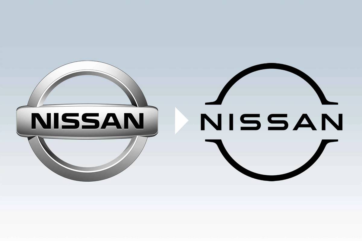
What Nissan says: The automaker said in July 2020 that its “new logo looks to the future while staying proudly connected to the company’s rich heritage and tradition of innovation. The company name remains at the center of the logo, communicating an instantly recognizable brand that evokes past milestones and memories while also conveying evolution.”
What Paul says: “Another light font for the digital age. Nissan’s designers stripped the old badge down, removing the chrome gradations to reveal this airier, open rebrand. It works, though I miss a little of the crossbar in this design for continuity from the old shape. With a slight modification of the font, the only element left of the old brand is the spurs jutting outside of the circle. It feels a little too skeletal.”
What Ken says: “Nissan goes a little further than BMW in that its main logo is a flat monochrome logo. From a digital perspective, a quick-loading page (or ad) can increase your search-engine rating or ad visibility.”
What I say: In person, the new badge looks great. It gives a sort of retro-future feel, which it seems is what Nissan was going for. Nicely done.
Volkswagen
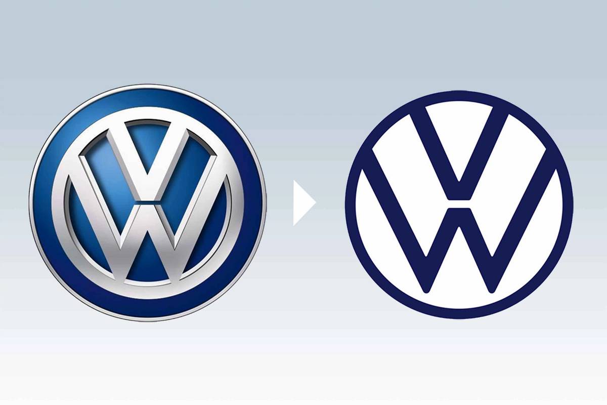
What VW says: The automaker said in April 2020 that its “new design is a refreshed, minimalist take on the classic logo, allowing for more flexibility and versatility when it comes to the signature symbol. It’s a modern and simpler version of the previous logo, which has identified the brand for over 70 years. Led by Volkswagen Chief Designer Klaus Bischoff, the new branding was designed to be versatile, ‘digital-first’ and reduces the logo to essential elements, which now presents as flat and two-dimensional.”
What Paul says: “My favorite of the brand refreshes. It has a little bit of a retro feel going back to the simplicity of the VW mark in the 1960s and 1970s with thinner lines. The outside circle is just slightly thinner that the ‘VW’ within, which is a nice touch, too. Keeping the ‘W’ up off the circle gives it an airy feel. It increases the negative spaces, which to me look like wings, adding to the lightness.”
What Ken says: “It’s not a huge change, but I prefer the proportions and contrast of the original logo.”
What I say: I dig the flatness. It’s simple and straightforward, and I’m always a fan of blue.
More From Cars.com:
- Which Cars Have Third-Row Seats?
- What’s New With Electric Vehicles for 2021?
- Here Are 5 Great Affordable Luxury Cars You Can Buy Right Now
- Which Automaker Has the Best MPG Cars?
- Which Cars Have Amazon Alexa Integration?
Related Video:
Cars.com’s Editorial department is your source for automotive news and reviews. In line with Cars.com’s long-standing ethics policy, editors and reviewers don’t accept gifts or free trips from automakers. The Editorial department is independent of Cars.com’s advertising, sales and sponsored content departments.

Road Test Editor Brian Normile joined the automotive industry and Cars.com in 2013, and he became part of the Editorial staff in 2014. Brian spent his childhood devouring every car magazine he got his hands on — not literally, eventually — and now reviews and tests vehicles to help consumers make informed choices. Someday, Brian hopes to learn what to do with his hands when he’s reviewing a car on camera. He would daily-drive an Alfa Romeo 4C if he could.
Featured stories
